今日推荐开源项目:《AmericaOpposeAmerica》
今日推荐英文原文:《Fall in Love With Single-Div Illustrations》

今日推荐开源项目:《AmericaOpposeAmerica》传送门:项目链接
推荐理由:一本很老的书,靠着 OCR(机器与人力)还原了。讲的是关于美国具有两种相对力量的有关话题,所以用了美国反对美国这个看似很不合逻辑的名字。
今日推荐英文原文:《Fall in Love With Single-Div Illustrations》作者:Albert Walicki
原文链接:https://medium.com/better-programming/fall-in-love-with-single-div-illustrations-674ddeb51c62
推荐理由:如何使用一个 div 元素进行绘画
Fall in Love With Single-Div Illustrations
I’ve always admired people who create single-div illustrations in CSS. One div, multiple background layers, tons of CSS code, and boom! You have an illustration. I always thought that it must be challenging and I could never create such a thing. I was wrong.To create a simple image, you only need to know one thing: how backgrounds work in CSS. That’s it. You don’t have to use CSS variables. They help to maintain clean code. It’s much easier to read those images with variables, but it’s not required.
Simplest Illustration
Let’s start with something straightforward. If you understand this example, you will be ready to go://HTML
<div></div>
//CSS
div {
width: 100px;
height: 100px;
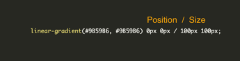
background: linear-gradient(#9B59B6, #9B59B6);
background-position: 0px 0px;
background-size: 100px 100px;
background-repeat: no-repeat;
}
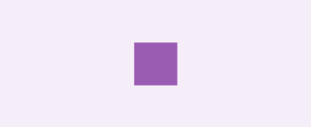
Our first single-div image!
OK, what we have here? A 100x100px rectangle with a linear-gradient starting and ending with the same colour. Our first background has also defined background-position: 0px 0px; on the X-axis and 0px on the Y-axis. This means that our background starts on the top left corner. Then we have background-size: 100px 100px;, which obviously defines the size of our purple colour. And the last one, background-repeat: no-repeat;, is to prevent replying to our layers.
Conclusion:
- Our div is the solid #9B59B6 colour because we start and end the gradient with the same colour.
- It is 100x100px.
//HTML
<div></div>

//CSS
div {
  width: 100px;
  height: 100px;
  background: linear-gradient(#fff, #fff), linear-gradient(#9B59B6, #9B59B6);
  background-position: 35px 35px, 0px 0px;
  background-size: 30px 30px, 100px 100px;
  background-repeat: no-repeat;
}
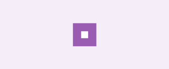
First example with an additional layer
And that’s it! We have two linear-gradient layers on each other. Pay attention to the layer order! Earlier layers are on top of the others. Think about it as a z-index.
I don’t like having properties broken into pieces, so let’s clean up a bit:
div {
  width: 100px;
  height: 100px;
  background:
    linear-gradient(#fff, #fff) 35px 35px / 30px 30px,
    linear-gradient(#9B59B6, #9B59B6) 0px 0px / 100px 100px;
  background-repeat: no-repeat;
}
The forward slash separates background-position values and background-size values. The formal syntax requires the slash.
Linear gradient position and size
If we have more background layers, things might be a little bit messy. You probably won’t remember if line 31 of the background goes for a window or maybe a fence.
This is much cleaner!
div {
  --white-square: linear-gradient(#fff, #fff) 35px 35px / 30px 30px;
  --purple-square: linear-gradient(#9B59B6, #9B59B6) 0px 0px / 100px 100px;
  width: 100px;
  height: 100px;
  background:
    var(--white-square),
    var(--purple-square);
  background-repeat: no-repeat;
}
Small House
You already know enough to create illustrations. To warm up before the final exercise, let’s make a small house.We need a few layers:
- Front of the house
- Door
- Left part of the roof
- Right part of the roof
- Window 1 and Window 2
//HTML
<div></div>

//CSS

div {
  --roof-one: linear-gradient(15deg,#9c7842 12%,transparent 12.5%) 50px -10px / 380px 30px;
  --roof-two: linear-gradient(-15deg,#9c7842 12%,transparent 12.5%) -330px -10px / 380px 30px;
  --window-one: linear-gradient(#fff, #fff) 20px 40px / 10px 10px;
  --window-two: linear-gradient(#fff, #fff) 70px 40px / 10px 10px;
  --house-door:  linear-gradient(#635327, #635327) 40px 40px / 20px 30px;
  --house-front: linear-gradient(#cc943f,#cc943f) 0px 20px / 100px 50px;
  width: 100px;
  height: 70px;
  background:
    var(--window-one),
    var(--window-two),
    var(--roof-one),
    var(--roof-two),
    var(--house-door),
    var(--house-front);
  background-repeat: no-repeat;
}
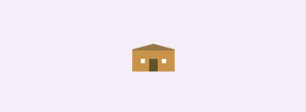
Single-div house
You can play with this house here on CodePen.
Triangles
The most challenging part of this house is to create triangles. Let’s split this code into pieces.Let’s work on this example:
//HTML
<div></div>

//CSS

div {
  width: 100px;
  height: 100px;
  background: linear-gradient(0deg,#9c7842 50%, red 50%) 0px 0px / 100px 100px;
  background-repeat: no-repeat;
}
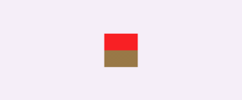
Linear-gradient with 50%/50% red and brown colours
Our goal is to create a triangle for our roof. Currently, our gradient has a zero-degree angle, so let’s change it. I would like to have a small roof slope angle, so I changed it to 12 degrees:
//HTML
<div></div>

//CSS

div {
  width: 100px;
  height: 100px;
  background: linear-gradient(12deg,#9c7842 50%, red 50%) 0px 0px / 100px 100px;
  background-repeat: no-repeat;
}
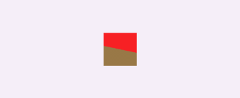
Linear-gradient with 50%/50% red and brown colours and 12-degree angle
I think you know what you should do now. Let’s decrease the percentage of the gradient. I changed it to 19 degrees to have a perfect starting point on the right side:
//HTML
<div></div>

//CSS
div {
  width: 100px;
  height: 100px;
  background: linear-gradient(12deg,#9c7842 19%,red 19%) 0px 0px / 100px 100px;
  background-repeat: no-repeat;
}
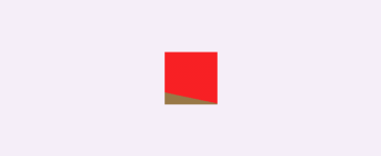
Triangle almost done
Lastly, we need to replace the red background with a transparent one:
//HTML
<div></div>

//CSS

div {
  width: 100px;
  height: 100px;
  background: linear-gradient(12deg,#9c7842 19%,red 19%) 0px 0px / 100px 100px;
  background-repeat: no-repeat;
}
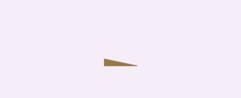
Our roof element
And here we have a nice roof with a right angle.
下载开源日报APP:https://2025.openingsource.org/2579/
https://2025.openingsource.org/wp-admin/edit.php加入我们:https://2025.openingsource.org/about/join/
关注我们:https://2025.openingsource.org/about/love/
